Elevate Your MVP’s UI/UX: Good Design vs. Bad Design Examples
By Taher Pardawala · Co-Founder & Chief Executive Officer
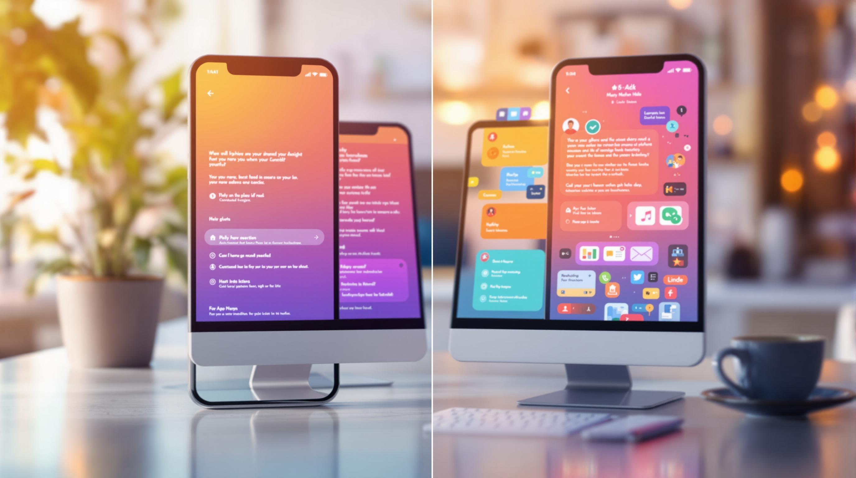
Good UI/UX design can make or break your MVP. A clear, user-friendly interface improves engagement, provides actionable feedback, and validates your product idea. In contrast, poor design frustrates users, damages your brand, and wastes resources.
Key Takeaways:
- Good Design Principles: Simplicity, consistency, and user-centric navigation.
- Bad Design Pitfalls: Overly complex interfaces, inconsistent navigation, and poor responsiveness.
- Examples:
- Good: Dropbox’s simple file-sharing interface.
- Bad: Electroloom’s confusing workflows and lack of feedback.
- Impact: Well-designed MVPs can increase conversion rates by up to 200%.
Quick Comparison Table:
| Aspect | Good Design | Bad Design |
|---|---|---|
| Navigation | Clear and logical pathways | Confusing menus |
| Content Layout | Clean and uncluttered | Overwhelming and cluttered |
| Feedback Systems | Clear and actionable | Vague or missing |
| Visuals | Purpose-driven graphics | Distracting or irrelevant imagery |
| Typography | Readable fonts with proper spacing | Hard-to-read fonts, poor contrast |
Start your MVP with a focus on solving user problems through simple, functional design. Test prototypes, gather feedback, and consider working with professional designers to avoid costly redesigns later. Good design isn’t optional - it’s essential for your MVP’s success.
Related video from YouTube
Good vs. Bad Design: Key Ideas and Examples
Creating a strong MVP starts with a design that is simple, user-friendly, and helps validate your product idea. Take Grammarly, for example. Their onboarding process is a standout - users are guided through key features with short, clear instructions that make everything easy to grasp [2].
Core Principles of Good Design
Good design follows a set of clear principles that make the user experience seamless:
| Principle | How It’s Applied |
|---|---|
| Simplicity | Clean, uncluttered layouts |
| Consistency | Uniform colors, fonts, and styles |
| User-Centric Approach | Easy-to-use navigation and workflows |
While these principles are essential, knowing what to avoid is just as important.
Common Problems in Bad Design
Bad design choices can ruin user experiences. Here are some common mistakes and how to fix them:
| Design Flaw | What It Causes | How to Fix It |
|---|---|---|
| Overly Complex Interfaces | Confuses users, lowers engagement | Simplify workflows, focus on key features |
| Inconsistent Navigation | Frustrates users, leads to drop-offs | Standardize menus and buttons |
| Lack of Responsiveness | Limits usability on devices | Prioritize mobile-friendly design |
Good vs. Bad Design: A Side-by-Side Comparison
Let’s break down how good and bad design choices play out in real-world MVPs:
| Design Element | Good Design | Bad Design |
|---|---|---|
| Content Layout | Spotify’s clean playlist interface | Cluttered screens with too much information |
| Navigation | Clear, logical pathways | Confusing menus that users struggle to find |
| Visuals | Graphics that serve a purpose | Distracting or irrelevant imagery |
| Typography | Easy-to-read fonts and proper spacing | Hard-to-read fonts with poor contrast |
| Feedback Systems | Clear confirmations for user actions | Vague or missing feedback on actions |
Studies show that well-thought-out design can increase conversion rates by up to 200% [3]. That’s a huge difference, and it highlights the impact of getting these details right.
Case Studies: Examples of Good and Bad MVP Design
Let’s look at some real-life MVPs to see how their design choices influenced their success - or failure.
MVPs That Got Design Right
Dropbox is a great example of an MVP that nailed its design. From the start, it focused on making file sharing simple. Users could upload files in just a few steps, easily check sync statuses, and navigate folders without confusion. This simplicity helped Dropbox gain traction and validate its idea quickly.
MVPs That Struggled with Poor Design
On the flip side, Electroloom, a startup aiming to transform clothing manufacturing, struggled due to design missteps. Here’s where they fell short:
| Design Flaw | Impact |
|---|---|
| Complex Interface and Workflow | Users found it hard to complete basic tasks, leading to a steep learning curve |
| Poor Feedback Systems | Users were left unsure about the status of processes, causing frustration |
Even with promising technology, Electroloom’s clunky user interface created barriers instead of solving them. Research shows that over 40% of startups fail due to a lack of market demand [1], and poor user experience often worsens this problem.
These examples underline how crucial good design is for an MVP. They also pave the way for practical tips to improve your own development process.
Best Practices for MVP UI/UX Design
Steps to Design an MVP
Building an MVP starts with understanding your audience through market research. It’s all about addressing user needs while keeping business goals in mind. Here’s how to approach it:
1. Define Product Requirements
Craft a Product Requirements Document (PRD) that outlines:
- Clear problem statements
- Detailed user personas
- Success metrics
- Key assumptions and constraints
2. Create and Test Prototypes
Take a page from Airbnb’s playbook - they tested their MVP with real users in San Francisco. Their process included:
- Developing low-fidelity wireframes
- Testing key user flows
- Gathering immediate feedback
- Making rapid iterations
3. Focus on Core Features
| Design Priority | Implementation Strategy | Impact |
|---|---|---|
| Core Features | Build solutions to main problems | Quicker launch timeline |
| User Flow | Simplify essential interactions | Easier onboarding |
| Visual Design | Use consistent UI elements | Builds user confidence |
After designing your MVP, the next step is to gather feedback and refine the product further.
Using Feedback to Improve Design
Feedback is a game-changer for improving your MVP. Use these methods to collect insights:
- Moderated user testing sessions
- Analytics to track user behavior
- One-on-one user interviews
- In-app feedback tools
While feedback helps shape your product, working with skilled designers ensures your MVP starts strong.
Why Work with Professional Designers
Feedback is essential, but partnering with experienced designers sets your MVP up for success from the beginning. AlterSquare.io’s data shows startups collaborating with professional designers often see:
- Faster MVP development (typically within 90 days)
- Better user adoption rates
- Fewer major redesigns after launch
Professional designers bring expertise in areas like user research, prototyping, usability testing, and creating cohesive design systems. Their input minimizes mistakes and ensures your MVP delivers real value to users right from the start.
Conclusion: The Role of UI/UX in MVP Success
Key Points to Remember
UI/UX design plays a major role in the success of MVPs. Forrester’s research shows that well-designed user interfaces can increase conversion rates by up to 200%, while improved UX can push those rates up to 400% [3]. These numbers highlight how design influences user engagement and product adoption.
Take Grammarly as an example. Its smooth onboarding process, which includes clear instructions and guided feature discovery, illustrates how focusing on user experience from the start can drive adoption [2].
| Success Factor | Impact on MVP | Business Benefit |
|---|---|---|
| Clear User Flow | 40% drop in user abandonment | Better retention rates |
| Intuitive Design | Up to 200% more conversions | Higher ROI |
| Professional Design | 90-day development cycle | Faster time to market |
These principles offer a roadmap for startups aiming to create a successful MVP.
Final Advice for Startups
When building your MVP, make design choices that directly address what users need. Start with user research and prototype testing to lay a solid groundwork for your product.
"UI/UX drives MVP success by solving real user problems, boosting engagement, and ensuring satisfaction" [1].
Working with experienced designers early on can speed up development, reduce the need for redesigns, and ensure your MVP delivers value right away. A well-thought-out design focuses on solving user problems through simple, functional solutions that truly connect with your audience.