
Figma-to-Code in 2026: How the Top Design-to-Code Tools Compare on Real Component Work
Taher Pardawala June 26, 2026
Most Figma-to-code tools still save time on UI scaffolding, not on final production code. If I had to reduce the article to one line, it would be this: Builder.io is the best fit for teams that need output to match an existing codebase, Figma Dev Mode is best for handoff, Figma Make is best for demos, and Locofy/Anima/TeleportHQ/Quest are best used as first drafts.
I’d also keep these points front and center:
- Figma Dev Mode is for inspection and handoff, not code generation
- Figma Make generates React + TypeScript prototypes, but cleanup is usually high
- Builder.io Visual Copilot is the strongest option when your team already has a design system and wants code mapped to existing components
- Locofy supports many web and mobile targets, but teams still need manual work for state, responsiveness, and accessibility
- Anima can look close to the design, but output often needs heavy refactoring, especially when Auto Layout is weak
- TeleportHQ adds a visual editor step and is best for simple static web UI
- Quest is React-first and tries to keep hand-written logic safe through GitHub sync, but nested component handling can still be messy
The article compares each tool on four things that matter most in production work:
- component fidelity: tokens, variants, Auto Layout, and component boundaries
- code structure: file splitting, wrappers, readability, and semantic HTML
- framework support: React, Next.js, Vue, SwiftUI, Flutter, and more
- engineering rework: accessibility fixes, state wiring, token cleanup, and refactoring
What stood out to me is that none of these tools remove engineering cleanup. In the article, first-draft tools like Anima, TeleportHQ, and Quest are framed as leaving about 30% to 40% of normal development time for follow-up work. And automated accessibility checks still catch only about 30% of WCAG issues in AI-generated output.
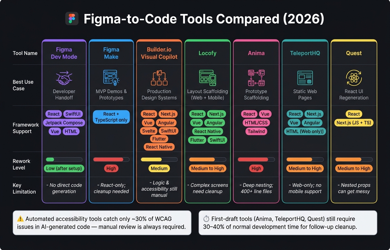
Figma-to-Code Tools Compared: Best Use Cases & Rework Levels (2026)
Claude Design vs Lovable vs Figma Make: The Ultimate AI Design Challenge
sbb-itb-51b9a02
Quick Comparison
| Tool | Best use case | Main strength | Main limit | Rework level |
|---|---|---|---|---|
| Figma Dev Mode | Developer handoff | Specs + Code Connect to existing code | No direct production code generation flow | Low after setup |
| Figma Make | MVP demos and clickable prototypes | Fast React/TSX generation | React-only; output often needs refactoring | High |
| Builder.io Visual Copilot | Existing design systems and repos | Maps Figma to current components and stack | Logic, props, and accessibility still need manual review | Medium |
| Locofy | Layout scaffolding across web/mobile | Broad framework support; modular export | Complex screens still need cleanup | Medium to high |
| Anima | Prototype scaffolding and design review | Good visual match from clean Figma files | Deep nesting, wrapper-heavy output | High |
| TeleportHQ | Static web pages | Visual editor before export | Web-only; weaker fit for state-heavy UI | Medium to high |
| Quest | React UI regeneration with GitHub sync | Keeps presentation code separate from custom logic | Nested props and export issues can show up | Medium to high |
If I were picking fast, I’d use this rule:
- choose Dev Mode for handoff
- choose Make for demos
- choose Builder.io for production React/Next.js work with an existing system
- choose Locofy for broad framework coverage, including mobile targets
- treat Anima, TeleportHQ, and Quest as scaffolding tools, not final code sources
That’s the core takeaway from the full comparison.
1. Figma Dev Mode and Figma Make
Against those criteria, Figma’s native tools split into two buckets: handoff and generation. Figma Dev Mode works as a developer inspection and handoff layer. It gives teams specs, CSS/iOS/Android snippets, and links Figma components to existing production code through Code Connect. Figma Make, on the other hand, generates interactive React/TSX prototypes from natural-language prompts or Figma designs. Figma Make reached general availability on July 24, 2025, and it runs on Anthropic’s Claude Sonnet [6].
The key difference is where each tool puts the work. Dev Mode puts it at inspection and mapping. Make puts it at generation and cleanup.
Positioning and Workflow
Dev Mode fits teams that already have a codebase. Developers can inspect designs, check specs, and use Code Connect to pull in real production snippets instead of autogenerated guesses. That matters because it keeps handoff closer to the code the team already ships.
Make is aimed at component fidelity through prompting. Designers can iterate with point-and-edit workflows and get a live, interactive app without writing code. It’s a much different motion: less handoff, more instant prototype.
Component Fidelity
In Dev Mode, fidelity depends on Code Connect mappings. If those mappings are set up well, teams see the exact snippets defined in their codebase.
Make used to lean more toward generic UI generation. Make Kits changed that. They let organizations ground generation in their own React design system packages and brand guidelines. In practice, Make Kits let design system authors create customized, reusable packages that combine their library’s components or styles with detailed guidelines that teach Make how to use them [7].
Code Structure and Framework Support
Make outputs React + TypeScript only. That’s a narrow lane by design.
Dev Mode, through Code Connect, supports more options:
- React
- SwiftUI
- Jetpack Compose
- Vue
- HTML/Web Components
Make’s output often still needs cleanup, especially around wrapper depth and minimal error handling. It can be good enough for a prototype, but it usually isn’t ready to merge into a production repo without refactoring [6].
Expected Rework
Dev Mode shifts work toward the front of the process: initial Code Connect setup and ongoing mapping maintenance. Make shifts work toward the back: post-generation refactoring.
Repo-connected editing is in closed beta on Mac [8]. The split is pretty clear in the table below.
| Feature | Figma Dev Mode | Figma Make |
|---|---|---|
| Primary Purpose | Developer inspection and handoff | AI-driven prototyping and app generation |
| Frameworks | React, SwiftUI, Jetpack Compose, Vue, and HTML/Web Components | React + TypeScript (TSX) only |
| Fidelity Mechanism | Code Connect mappings | Make Kits |
| Rework Level | Low (after setup) | High (architecture, nesting, error handling) |
| Best For | Teams with existing repos and design systems | Designers validating ideas or building small apps |
2. Builder.io Visual Copilot
Builder.io is the first third-party tool in this comparison that focuses on turning Figma output into code that fits an existing codebase. Instead of starting from scratch, it maps Figma frames to code that follows your current stack, components, and patterns.
Positioning and Workflow
The workflow is pretty direct. In Figma, you select a frame, run the generated npx command, and let the CLI inspect your repo, framework, and styling setup. From there, you can use chat to split components, add logic, or clean up the structure.
Component Fidelity
How close the output gets depends a lot on how well the tool reads your design system. The index-repo command scans your codebase for existing components, icons, and design tokens. Builder.io says this automated discovery typically reaches about 70% mapping accuracy by default [5].
If you want tighter reuse, developers can create mapper files that connect a Figma component to a specific code component. That gives you more exact 1:1 mapping. Auto Layout also matters a lot here, especially for responsive output.
Code Structure and Framework Support
Visual Copilot works with a broad range of web and mobile targets across multiple frameworks and styling setups. The table below shows the full support list.
Expected Rework
Even with repo indexing and mapper files, some cleanup is still part of the job. You’ll still need manual follow-up for logic, state, and prop mapping. On the accessibility side, Builder.io supports an Accessible code prompt, but it’s still smart to manually check ARIA attributes and keyboard navigation before shipping.
The summary below shows where Builder.io fits best and where manual cleanup still remains.
| Feature | Capability |
|---|---|
| Web Frameworks | React, Next.js, Vue, Angular, Svelte, Qwik, Solid.js, Marko, Mitosis, HTML |
| Mobile Frameworks | SwiftUI, React Native, Flutter, Kotlin, Compose (Beta) |
| Styling | Tailwind CSS, CSS Modules, Emotion, Styled Components, Styled JSX, CSS |
| Mapping Accuracy | Automated discovery; deterministic 1:1 mapping with manual mapper files |
| Post-generation work | Manual follow-up needed for logic, state, prop mapping, and accessibility checks |
3. Locofy
Locofy is best understood as a module-first generator. Its pitch is simple: produce reusable, readable components instead of one big blob of code [11][1].
Positioning and Workflow
The process starts in Figma Design mode. From there, Locofy Lightning scans Auto Layout, spots buttons, inputs, and other common UI parts, and gives users a chance to refine the result in Agent Mode before exporting to Locofy Builder or the CLI [9][10]. Locofy also works with MCP in Cursor, Claude Code, and Windsurf [16].
If a team already has a design system, Locofy can sync code components through the CLI or MCP with locofy.config.json [14][15].
That puts Locofy in a scaffold-first lane. It does a better job with structure than pure prompt-based generation, but it still needs cleanup after export.
Component Fidelity
This is where things either hold up or fall apart. The main question is whether component boundaries, tokens, and states make it through export cleanly.
Locofy names components based on Figma layers and splits code into separate files like PricingCard.tsx and ComparisonTable.tsx [11]. It supports:
- Auto Layout converted to Flexbox
- Variants
- Text and Boolean properties
- Instance Swaps
- Figma Variables for colors and numeric values like padding, gap, and radius [12][13]
It also supports hover and pressed states without extra design layers [13].
Code Structure and Framework Support
The exported code usually uses one CSS module per component and semantic HTML tags such as <section> and <button> [11]. Locofy also outputs TypeScript types and maps tokens to CSS variables, which helps keep the code readable [11][1].
By default, styling uses CSS Modules. Tailwind CSS support was added in late 2025, and responsive behavior can be adjusted with pixel-based or relative units, along with custom media queries [1][13].
| Feature | Locofy support |
|---|---|
| React / Next.js | Supported, including App Router [1][9][13] |
| Vue 3 | Supported, including Composition API [1][9][13] |
| Angular / Gatsby | Supported [13] |
| React Native / Flutter | Supported [13] |
| SwiftUI / Jetpack Compose | Supported [13] |
| TypeScript | Supported [1] |
| MCP workflow | Supported in Cursor, Claude Code, and Windsurf [16] |
Expected Rework
Teams still have to deal with state logic, tricky responsive cases, accessibility work, and mapping to design-system components [9][11]. So the safest way to use Locofy is as a scaffold for marketing pages and landing pages, not as a finished component architecture.
For more complex product interfaces, expect a lot of manual follow-up [4].
Next, the comparison moves to another tool with similar export tradeoffs, but a different workflow.
4. Anima
Anima is the most installed design-to-code plugin on Figma, with more than 1.5 million installs as of 2026 [2]. Like Locofy, it works best as a scaffold-first tool. But in day-to-day use, it tends to need more hands-on cleanup.
Positioning and Workflow
Anima is a plugin-first scaffold tool, not a full code generator. For token-aware export, the Figma plugin is the better pick. It also handles large files more reliably than the web app [18].
That said, the output is heavily shaped by how clean the Figma file is. If layers are named well and the structure is tight, results are better. If the file is messy, the code usually shows it.
Component Fidelity
When Figma Auto Layout is used the right way across a file, Anima converts it straight into CSS Flexbox and maps component variants to React props [18]. That part works well.
When Auto Layout is missing, though, Anima falls back to absolute positioning and hardcoded pixel values. That makes the output less responsive and harder to work with later [19].
It also supports variants, constraints, and text styles. But native hover states don’t carry over cleanly, so Anima needs its own hover setup [21].
Code Structure and Framework Support
The code is usable, but it often comes out monolithic. Deep nesting is common, and refactoring is usually part of the job before anything goes into production [19].
A standard component can end up nested 9 to 11 levels deep, which can turn one section into a 400+ line file instead of a small set of reusable components [19]. That’s the kind of output that works as a draft, not a finished build.
| Feature | Anima Support |
|---|---|
| React (JS/TS) | Supported, including Next.js |
| Vue (v2/v3) | Supported |
| HTML/CSS | Supported |
| Tailwind CSS | Supported |
| Styled Components / CSS Modules / SASS | Supported |
| UI Libraries | MUI, Ant Design |
| State Management | State must be wired manually |
If your team already uses MUI or Ant Design, those integrations can cut some setup work. Anima’s Frontier VS Code extension can also help connect generated code to an existing codebase and reuse current components [20].
Expected Rework
In practice, every component needs a review. The usual cleanup work includes:
- splitting up large files
- removing extra wrapper
divs - fixing responsiveness
- wiring state by hand [17][19]
Anima works best as a starting point for component scaffolding when the Figma file is strict about Auto Layout and naming. The next group looks at plugin-based tools that lean even harder toward speed over structure.
5. TeleportHQ
TeleportHQ is built around framework-agnostic output and sticks to that approach by design [22]. Unlike the earlier scaffold-first tools, it adds one more step before export: a visual editor.
Positioning and Workflow
Earlier tools lean toward direct export. TeleportHQ takes a different path and puts a visual edit step in the middle.
In Figma, you launch the plugin from a frame, group, or element. From there, you can either export as a new project or copy objects to the clipboard for an existing TeleportHQ project [23]. After that, the design opens inside TeleportHQ’s visual editor. That’s where you tweak layouts, set up responsiveness, and clean up components before exporting code or publishing a live static site [22][23][25].
That extra step does slow things down a bit. But it also gives you more control before the code is generated, which can lead to cleaner output.
Component Fidelity
TeleportHQ depends on Auto Layout and naming rules to map structure and semantic tags [23]. So if you name a layer "Button" or "Input", the generator is more likely to assign the right tag on its own [23].
It works best when the design is clean and well organized. Once visuals get more complex or component behavior goes beyond the basics, fidelity starts to slip. At that point, manual cleanup is common.
Code Structure and Framework Support
TeleportHQ runs through its own framework-agnostic layer before generating code [26][27]. It supports a broad set of web frameworks:
| Framework | Status |
|---|---|
| React | Supported, with CSS Modules, Styled Components, Styled JSX, JSS, and inline styles [24] |
| Next.js | Supported |
| Vue / Nuxt | Supported |
| Angular | Supported |
| Preact / Stencil | Supported |
| HTML/CSS | Supported |
| Flutter / React Native | Not supported [22] |
One clear limitation: mobile output isn’t part of the product. TeleportHQ is web-only [22].
Expected Rework
That puts TeleportHQ in a better spot for structure than for polished production output. It fits simple landing pages and static UI well enough, but dashboards and form-heavy screens with lots of state usually need refactoring.
Use it for simple static UI, not complex interactive screens.
6. Quest
Quest narrows the tradeoff even more by zeroing in on React output and keeping custom logic intact through GitHub sync. It’s a React-first tool built to generate presentation-layer code, while your hand-written business logic stays separate.
Positioning and Workflow
You start in the "Figma to React from Quest" plugin, pick a frame or component, and send it to the Quest editor. From there, you can set up props, bindings, and state rules, then either download a ZIP or sync the result to GitHub.
The GitHub sync uses merge logic meant to preserve custom code, so design updates don’t wipe out logic your team already wrote in the codebase [28]. That changes the usual worry from "Will this overwrite our work?" to "How much of the Figma structure makes it through cleanly?"
One thing worth noting: the Figma plugin documentation was last updated in September 2023, which could matter if you’re checking support for newer Figma features [28].
Component Fidelity
Quest supports Auto Layout, variants, and responsive layouts. It turns variants into component states and can add animations, video, tooltips, and grid layouts [28].
That said, third-party feedback points to export issues and weaker props handling in nested components [28]. So while the core output may look solid, nested setups can get messy fast.
Code Structure and Framework Support
| Feature | Details |
|---|---|
| Frameworks | ReactJS, Next.js, Create React App (CRA) [28] |
| Languages | JavaScript and TypeScript [28] |
| UI Libraries | MUI and Chakra UI; custom design systems supported [28] |
| Export Options | ZIP download or GitHub sync with merge logic intended to preserve custom code [28] |
Quest describes its output as presentation-layer code built to stay separate from business logic [28].
Expected Rework
Quest makes sense for teams that want to regenerate UI without disturbing custom logic. For simple React components, cleanup should be fairly limited. Once interactions get more complex, though, you’ll still need manual engineering work [28].
7. Figma-to-Code Plugins (Grouped)
This section groups the three plugin-based tools into a short, practical view of fit, structure, and cleanup. The main issue isn’t export speed. It’s how much cleanup the output leaves behind.
Positioning and Documented Workflow
In day-to-day use, each tool tends to serve a different job. Locofy leans toward marketing and landing pages. Anima is aimed more at interactive prototypes. Builder.io is built to generate production code that reuses an existing design system [4][11].
That positioning matters more than it may seem at first glance. It affects the shape of the code, how components are split, and how much manual editing comes next.
Component Fidelity
All three tools depend heavily on file quality, but they don’t behave the same way.
Builder.io keeps structure closest to the source when design-system mapping is set up the right way. Locofy does a decent job holding component boundaries on straightforward layouts. Anima is the most sensitive to file quality, and its structure tends to be the least consistent when Auto Layout is missing or uneven [11][29].
Code Structure and Framework Support
The table below turns those differences into a faster decision view.
| Feature | Locofy | Anima | Builder.io |
|---|---|---|---|
| Primary Use | Marketing/Landing Pages | Interactive Prototypes | Production Design Systems |
| HTML Quality | Semantic (<section>, <table>) |
Wrapper-heavy markup | Good (SDK-dependent) |
| CSS Approach | CSS Modules | Styled-components (px) | Tailwind, CSS Variables, Emotion |
| Component Splitting | Logical / modular | Single large files | Maps to existing components |
| Responsiveness | Partial; manual fixes needed | Often broken / fixed widths | Platform-handled |
Expected Rework
None of these tools gives you a clean handoff with zero edits. You should still expect manual work around responsiveness, semantics, state, and accessibility.
The next section breaks these tradeoffs into a simple pros-and-cons view.
Pros and Cons by Tool
The big difference here isn’t whether these tools can generate code. They all can. The real question is how much cleanup you’ll need to do after the export.
That cleanup is rarely small. Automated accessibility tools catch only about 30% of WCAG issues in AI-generated output [2]. So no matter which tool you pick, expect follow-up work on accessibility, responsive behavior, semantics, and state wiring.
Here’s the quick decision view:
| Tool | Pros | Cons | Best for | Not ideal for |
|---|---|---|---|---|
| Figma Dev Mode / Make | Dev Mode is useful for specs; Make is fast for prompt-to-prototype work; native to Figma [4][6] | Prototype-grade output; deeply nested wrapper markup; sandbox runtime; React/TSX-only output [6] | Fast concept validation and internal prototypes [6] | Shipping production code to an existing repository [6] |
| Builder.io Visual Copilot | CLI maps to existing components and patterns; multi-framework support including React, Next.js, Vue, and Svelte [2][3][6] | Runtime dependency; complex initial setup [1][30] | Teams with established design systems and existing codebases [2][6] | Teams that want fully standalone output with minimal runtime dependency [1] |
| Locofy | Clean component structure; support for React, Next.js, React Native, and Flutter [2][1] | Can struggle with complex responsiveness; often leaves pixel-based output that needs conversion to relative units [2][1] | Rapid layout scaffolding from clean Figma files [1][4] | Complex web apps with heavy state management or intricate API logic [4] |
| Anima | High visual fidelity; Frontier VS Code extension for component mapping [2][1] | Absolute positioning; flat, non-componentized HTML; no mobile framework support [2][1] | High-fidelity interactive prototypes and stakeholder reviews [1][4] | Production-ready component structure [1] |
A simple way to think about it:
- Figma Dev Mode / Make is best when speed matters more than code quality.
- Builder.io Visual Copilot fits teams that already have a design system and want exports to line up with what they’ve already built.
- Locofy works well for getting layouts into code fast, especially from tidy Figma files.
- Anima shines when the goal is visual polish for demos and reviews, not app-ready structure.
The next section turns these tradeoffs into stack-specific recommendations.
Which Tool Fits Your Stack in 2026
Pick based on your product stage and stack, not on who has the longest feature list. That’s the better way to match the tool to the workflow you’re dealing with.
If you’re still in early exploration, Figma Dev Mode is enough. It gives developers accurate specs without generating code.
If you need an interactive MVP demo, Figma Make is a strong fit. It gets you from concept to clickable prototype fast, which helps when stakeholders need something they can tap through before production code exists.
For new React and Next.js projects, Builder.io Visual Copilot is often the better choice. Its CLI gives the AI repo context, so new views line up with the patterns already used in your codebase.
If your codebase is fragile or complex, go with Figma MCP in Cursor or VS Code. Generate components one at a time instead of trying to convert whole screens in one shot.
Use Anima, TeleportHQ, and Quest as first-draft scaffolding. They can help you get moving, but plan for a cleanup pass that takes 30–40% of normal development time [1].
Use the matrix below for a fast decision.
| Scenario | Recommended Tool |
|---|---|
| Developer handoff | Figma Dev Mode |
| Stakeholder demo or MVP prototype | Figma Make |
| React / Next.js with an existing design system | Builder.io Visual Copilot |
| Multi-framework or mobile (Flutter / React Native) | Locofy |
| Fragile or complex existing codebase | Figma MCP (component by component) |
| First-draft scaffolding | Anima, TeleportHQ, or Quest |
FAQs
How much cleanup should I expect after export?
Plan for 30 to 60 minutes of cleanup and polish after export. These tools can shrink initial frontend scaffolding time by 60% to 80%, but the output still usually needs a developer pass before it’s ready for production.
The biggest thing here is the quality of your Figma file. Clean layer names, auto-layout, design tokens, and mapped components usually lead to less rework. Messy files usually mean more cleanup.
Which tool is best for an existing design system?
Builder.io is the main pick for existing design systems because it can map Figma designs to your current component library and design tokens.
With a .builderrules configuration file or component mapping, teams can reuse patterns that already exist in the codebase instead of ending up with generic output. That means your current logic stays in place, and your production code can still follow design system standards.
Can any of these tools generate production-ready code?
It comes down to how strict you are about maintainability and how well the tool fits your day-to-day workflow.
Tools like Builder.io can get closer to production-ready output because they connect to your codebase, index your existing components, and map designs to the patterns you already use instead of spitting out generic code. That said, developers still need to step in and refine the result.
Locofy, on the other hand, may make more sense for internal tools or cases where speed matters most, rather than projects that need to grow and change over time.


Leave a Reply