
3 Frontend Performance Metrics Your Dashboard Doesn’t Track (But Your Users Feel Every Day)
Huzefa Motiwala March 24, 2026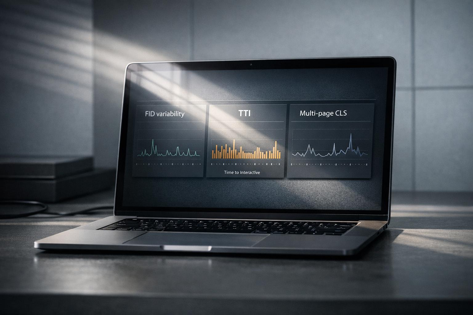
Your performance dashboard might look great, but users still face issues like slow interactions, frozen buttons, and layout shifts. Why? Standard metrics like averages miss critical details that affect user experience.
Here are three overlooked metrics that reveal these hidden problems:
- First Input Delay (FID) Variability: Shows how delays differ across devices and networks, impacting responsiveness.
- Time to Interactive (TTI) Degradation: Measures how long it takes for a page to become usable, beyond just loading visible content.
- Cumulative Layout Shift (CLS) Across Multiple Pages: Tracks layout instability during multi-step workflows, not just on individual pages.
These metrics highlight issues that frustrate users and hurt conversions. Learn how to measure and fix them effectively to improve performance where it matters most.
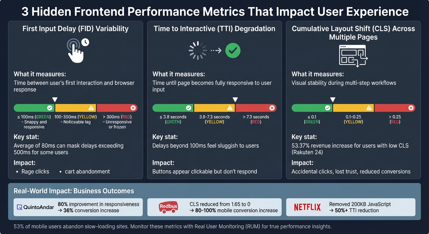
Frontend Performance Metrics Comparison: FID, TTI, and CLS Thresholds
Web Performance Fundamentals, v2 with Todd Gardner | Preview
sbb-itb-51b9a02
Metric 1: First Input Delay (FID) Variability
An average FID of 80 ms might sound acceptable, but it can mask significant delays – sometimes exceeding 500 ms – for certain users. This happens due to factors like hardware limitations, network conditions, and the timing of interactions [4][5]. FID measures the time between a user’s first interaction (like clicking a checkout button) and when the browser starts processing the corresponding event handlers [4][5]. The variability here is striking: one user might click during a quiet moment and get an instant response, while another clicks as a heavy JavaScript bundle is being processed, leaving the interface seemingly frozen. Let’s break down why dashboards often miss this variability, how to measure it effectively, and the real-world consequences for user experience.
Why Dashboards Miss FID Variability
This variability often goes unnoticed in standard analytics dashboards. Most dashboards report the p75 (75th percentile) FID value [4][5], which blends the faster experiences of high-end desktops with the slower ones of budget mobile devices. For example, a MacBook Pro might report a snappy 50 ms FID, while a low-end Android phone struggles with 500 ms [10][6]. By focusing only on the p75, you miss critical insights from the 95th to 99th percentiles – where the most frustrated users are [4].
"This variance in input delay underscores the importance of looking at the distribution of FID values when reporting on the metric." – Philip Walton, Engineer at Google [4]
Another common issue is the lack of segmentation by connection type (e.g., 4G vs. 3G) or device capability [4][6]. Without these details, it’s easy to overlook that users on slower networks or older devices might face delays exceeding 300 ms. At this threshold, interactions feel sluggish and can trigger "rage clicks" – a clear sign of user frustration [6][8].
| FID Rating | Threshold | User Perception |
|---|---|---|
| Good | ≤ 100ms | Snappy and responsive |
| Needs Improvement | 100–300ms | Noticeable lag |
| Poor | > 300ms | Unresponsive or "frozen" |
How to Measure FID Variability
To truly understand FID variability, you need real-world data from actual users. Lab tests simply can’t replicate the unpredictability of real interactions [4]. Tools like the OpenTelemetry Browser SDK, paired with the web-vitals library, can help track FID values along with contextual data such as network.effective_type (e.g., 4G, 3G, slow-2G) and device.memory [6][7].
For a more complete picture, use histograms to analyze the full distribution of FID values, including the 95th and 99th percentiles. To ensure you capture this data – even if users leave your site immediately after interacting – use methods like navigator.sendBeacon or the keepalive: true flag in fetch requests [9].
FID Impact Example
Imagine a user on a 3G connection tapping "Place Order" while heavy JavaScript processing blocks the main thread for 450 ms. Although the average FID for your site might be a decent 85 ms, this particular user experiences a laggy, unresponsive interface – and abandons their cart as a result. This is why understanding FID variability is essential for improving user experience.
Metric 2: Time to Interactive (TTI) Degradation
While FID sheds light on delays in processing user input, TTI focuses on when a webpage becomes fully responsive. TTI measures the time it takes for a page to become interactive – when key content is visible, event handlers are registered, and user actions receive responses within 50 ms [15]. A TTI score of 3.8 seconds or less is considered good, whereas anything beyond 7.3 seconds is rated poor [16]. These delays – like a button that appears clickable but doesn’t respond immediately – can seriously affect user retention.
"Measuring TTI is important because some sites optimize content visibility at the expense of interactivity. This can create a frustrating user experience: the site appears to be ready, but when the user tries to interact with it, nothing happens." – Chrome for Developers [15]
What TTI Measures and Why It Matters
TTI identifies the moment when a page not only looks ready but is actually prepared to handle user interactions. For instance, a "Place Order" button might show up within 2 seconds, but if heavy JavaScript execution is still ongoing, it may remain unresponsive. Research indicates that delays beyond 100 ms start to feel sluggish and unnatural to users [11].
It’s also worth noting that lab-based testing environments often miss these delays. Controlled conditions don’t account for real-world challenges like CPU variability, background tasks, or unstable mobile networks [1]. Single-Page Applications (SPAs) are particularly prone to these issues due to their reliance on client-side rendering and complex routing [11]. Pinpointing where these delays occur is the first step toward making meaningful optimizations.
Finding TTI Bottlenecks
To address TTI degradation, you need to uncover its root causes. Start by collecting real-world user data. Instrument your application with the attribution build of the web-vitals JavaScript library, which can track user interactions during page load and identify scripts that block the main thread [14]. Additionally, use a PerformanceObserver to log long tasks – those exceeding 50 ms – into your analytics [17]. The Long Animation Frames API (LoAF) can also provide detailed insights into which scripts (including their source URL and function names) are causing delays [14].
"A Long Task is JavaScript code that monopolizes the main thread for extended periods of time, causing the UI to ‘freeze’." – Addy Osmani, Engineering Leader [13]
When analyzing slow interactions, break them down into three stages: input delay (time from user action to browser processing), processing duration (time taken by event handlers to execute), and presentation delay (time from event handler completion to the next frame paint). This breakdown helps identify whether delays are caused by heavy script execution, computationally intensive JavaScript, or resource-heavy style and layout calculations [19].
How to Improve TTI
Reducing TTI involves streamlining your JavaScript payload. Code-splitting with tools like Webpack or Vite can ensure only the necessary code for the current view is loaded, while dynamic import() statements can defer non-critical scripts [12]. Breaking large operations into smaller sub-50 ms chunks using setTimeout or requestIdleCallback can also keep the page responsive [12].
To handle third-party scripts – such as those for analytics or ads – use tag managers to control their load order and defer their execution until after TTI is reached [18]. Offload heavy tasks like image processing or large JSON parsing to Web Workers to free up the main thread. Additionally, modern frameworks like React offer optimization techniques such as React.memo, useCallback, and useMemo to minimize unnecessary re-renders. For pages with long lists, virtualizing the DOM can significantly reduce the number of rendered elements, improving overall responsiveness [12].
Metric 3: Cumulative Layout Shift (CLS) Across Multiple Pages
This metric moves beyond FID and TTI to address user experiences across multiple pages. While dashboards often measure CLS on a single-page basis, users frequently navigate through multi-step workflows – like browsing products, filling out forms, or completing checkouts. Repeated layout shifts during these interactions can frustrate users and erode trust, creating a ripple effect of dissatisfaction. Below, we’ll explore how to monitor and minimize these shifts to ensure a smoother user journey.
Why CLS Matters Beyond Single Pages
Visual instability doesn’t just annoy users – it undermines their trust. Imagine clicking a button only to accidentally hit an ad because the content shifted at the last second. These misclicks hurt user confidence and can directly reduce conversions and revenue. For example, Rakuten 24, a Japanese e-commerce platform, reported a 53.37% increase in revenue per visitor and a 33.13% higher conversion rate for users experiencing low CLS compared to those dealing with high visual instability [22].
The problem becomes even more pronounced in Single Page Applications (SPAs), where persistent elements can shift during navigation, causing instability with every page transition. These compounded shifts degrade the overall user experience, which is why addressing CLS across sessions is crucial. It’s also worth noting that navigation-based shifts often go undetected in lab tests, which typically focus on initial page loads. As frontend engineer Arpan Sahoo aptly states:
"CLS is not just a ranking signal – it’s a trust signal" [23].
Tracking CLS Across Sessions
To truly understand CLS, it’s essential to monitor it throughout the entire user session, not just during the initial page load. CLS measures instability using "session windows", which group layout shifts happening within 5 seconds, as long as there’s less than a 1-second gap between shifts. The highest cumulative score from any session window is reported [24].
Using tools like the web-vitals JavaScript library with its attribution build can help pinpoint issues by identifying the largestShiftTarget and tracking when layout shifts occur during user interactions [26]. Additionally, you can report CLS data whenever a page is backgrounded or unloaded by leveraging the visibilitychange event. For SPAs, ensure your tracking includes route changes and measures shifts during navigation, not just on initial renders.
Once you’ve collected CLS data across sessions, the next step is implementing fixes to stabilize your layouts.
How to Reduce CLS
Reducing layout shifts involves a combination of strategies, including:
- Reserving space for media: Always specify
widthandheightattributes for<img>,<video>, and<iframe>elements. Unsized images are a leading cause of layout shifts – 66% of mobile pages include at least one [22]. You can also use the CSSaspect-ratioproperty to help browsers reserve space before resources load [25]. - Setting minimum heights for dynamic content: For elements like ads, banners, or API-driven widgets, define a
min-heighton their containers to avoid sudden expansions or collapses [20]. - Maintaining consistent dimensions in SPAs: Ensure shared layout containers remain consistent across routes. While data can load asynchronously, the layout should stay stable. Skeleton loaders should match the dimensions of the final content to prevent shifts when data populates.
- Optimizing font loading: Use
font-display: optionalto avoid shifts caused by slow-loading fonts. Alternatively, CSS descriptors likesize-adjustandascent-overridecan ensure fallback fonts occupy the same space as web fonts [25].
These optimizations can lead to impressive results. For instance, Redbus managed to lower its CLS from 1.65 to 0, which translated into an 80–100% increase in mobile conversion rates [21].
Setting Up Real User Monitoring (RUM) for These Metrics
Once you’ve tackled hidden performance issues, it’s time to gather data that reflects how users truly experience your site. While traditional dashboards rely on lab-based results, Real User Monitoring (RUM) captures how your application performs on real devices, networks, and browsers. As Nawaz Dhandala puts it:
"Real user monitoring gives you something synthetic tests never can: the truth about how your application performs for the people actually using it" [27].
For instance, a backend endpoint might respond in just 50 milliseconds, but if the browser takes 3 seconds to parse JavaScript and render the page, your users are still stuck waiting [27].
RUM is especially critical for metrics like INP, which only occur during real user interactions [29]. Similarly, while lab tests often measure CLS during the initial page load, RUM tracks layout shifts throughout the entire session [29]. This makes RUM indispensable for uncovering performance problems that synthetic tests might miss.
Installing Web-Vitals Instrumentation
To measure Core Web Vitals, start by installing the lightweight web-vitals JavaScript library (just 2KB). This handles browser API complexities and works seamlessly with @opentelemetry/sdk-metrics to create a solid RUM pipeline.
Set up a MeterProvider to generate histograms (e.g., p75, p95) for metrics like web_vitals.fid and web_vitals.cls. Why use percentiles instead of averages? Philip Walton explains:
"Averages are problematic because they don’t represent any single user’s session. Outliers at either range of the distribution may skew the average in ways that are misleading" [30].
Google relies on the 75th percentile (p75) to determine whether a site meets acceptable performance standards [6].
To ensure no data is lost when users navigate away, use a "force flush" during the visibilitychange event when the page becomes hidden. Tools like navigator.sendBeacon() or OpenTelemetry’s forceFlush() send data reliably without slowing down the page. This is especially important for metrics like CLS, which accumulate over time [6][30].
Enhance your metrics by including attributes like:
-
page.url: Tracks performance by specific pages. -
device.type: Differentiates mobile from desktop users. -
network.effective_type: Identifies network conditions (e.g., 4G, 3G).
Additionally, configure your frontend SDK to include trace headers (like traceparent) in API requests. This links slow frontend metrics directly to backend performance issues, making debugging much easier [27][7].
Building Dashboards That Show What Matters
Once RUM data is flowing, the next step is to design dashboards that provide actionable insights – not just raw numbers. Start with an overview panel showing p75 values for key metrics like FID and CLS, using a simple color-coded system:
- Green: "Good" (e.g., FID ≤ 100ms, CLS ≤ 0.1)
- Yellow: "Needs Improvement"
- Red: "Poor" (e.g., FID > 300ms, CLS > 0.25) [6].
Include 30-day time-series charts to help correlate performance changes with new deployments or infrastructure updates. This makes it easy to spot regressions tied to recent releases. Add tables that highlight the worst-performing pages and provide element-level details – such as which image or text block caused high CLS [7][31].
Breaking down data by connection type (e.g., 3G vs. 4G) can further reveal how performance varies under different conditions [31]. For deeper insights, overlay "Long Task" density (main-thread blocks over 50ms) with spikes in FID or INP. This helps identify specific scripts causing responsiveness issues [31].
These dashboards turn raw performance data into actionable insights, guiding teams toward fixes that align with user needs and business goals.
Getting Expert Review from AlterSquare‘s Principal Council
Even with RUM data, expert input is essential to prioritize the most impactful fixes. AlterSquare’s Principal Council – Taher (Architecture), Huzefa (Frontend/UX), Aliasgar (Backend), and Rohan (Infrastructure) – analyzes your RUM data to tie performance issues to business outcomes. For example, if your dashboard reveals high CLS on the checkout page, they can determine whether visual instability is causing users to abandon their carts, leading to revenue loss [28][31].
This expert review ensures you’re not just collecting data but using it strategically to improve user retention and boost conversion rates.
Conclusion
Traditional dashboards often focus on average load times and synthetic scores but fail to capture the metrics that truly define user experience. Metrics like FID variability, TTI degradation, and CLS provide critical insights into when interfaces freeze, engagement lags, or layout instability undermines user trust – issues that are particularly damaging on mobile devices, where 53% of users abandon slow-loading sites [3]. These overlooked metrics are essential for aligning user satisfaction with business outcomes.
For startups and companies with fragile systems, these hidden bottlenecks highlight deeper structural problems that can hinder scalability and user retention [1]. Ignoring these metrics can lead to escalating issues such as asset bloat, main-thread blocking on low-end devices, and trust-eroding layout shifts.
The path to meaningful improvement lies in ongoing performance monitoring and iterative optimization. Addressing these metrics can deliver measurable results: QuintoAndar boosted responsiveness (INP) by 80%, leading to a 36% year-over-year increase in conversions [2]. Similarly, Netflix eliminated over 200 KB of JavaScript by removing unnecessary libraries, cutting TTI by more than 50% [2]. As Dmitry Bastron aptly states:
"Performance is not a feature; it is a foundational requirement, as critical as security, accessibility, or functional correctness" [32].
The companies that succeed treat performance as an integral part of their infrastructure. They integrate Real User Monitoring, enforce performance budgets in CI/CD pipelines, and conduct regular audits to catch regressions before users are impacted. By consistently addressing these often-overlooked metrics, businesses can enhance both system resilience and user satisfaction.
If your system feels too fragile to update but too crucial to ignore, AlterSquare’s Principal Council can help. Experts like Taher, Huzefa, Aliasgar, and Rohan analyze your RUM data to identify bottlenecks affecting retention and revenue. They provide a Traffic Light Roadmap, prioritizing fixes based on business impact rather than just technical severity. Whether you need to stabilize a legacy system, modernize your frontend, or implement performance budgets to prevent future regressions, AlterSquare has the expertise to guide you forward without disrupting what’s already working.
Want to tackle those hidden performance issues? Start with an AI-Agent Assessment to identify and resolve them.
FAQs
How do I track FID by device and network type?
To monitor First Input Delay (FID) effectively across various devices and network types, leverage performance monitoring tools that offer data segmentation. Real User Monitoring (RUM) platforms are particularly useful, as they allow you to filter FID data by device categories like desktop, mobile, and tablet, as well as by network types such as WiFi, 4G, or 3G.
By configuring specific tests or setting up dashboards within these tools, you can break down the data to pinpoint performance bottlenecks tied to particular devices or network conditions. This approach makes it easier to identify and address issues that could be impacting user experience.
What should I use if FID is replaced by INP?
With First Input Delay (FID) being phased out, it’s time to shift focus to Interaction to Next Paint (INP). This metric offers a broader view of responsiveness, capturing how users experience interactions on your site more effectively. Adapting to INP ensures your performance metrics stay in line with current standards and give a clearer picture of user engagement.
How can I measure CLS across an SPA user session?
To keep an eye on Cumulative Layout Shift (CLS) during a single-page application (SPA) session, tools like the web-vitals library are incredibly handy. They let you monitor layout shifts as they happen in real-time. Pair this with real-user monitoring (RUM) to capture layout changes throughout the entire session – not just during the initial load. By tracking shifts continuously, you can pinpoint issues that disrupt visual stability and take steps to refine the overall user experience.


Leave a Reply