
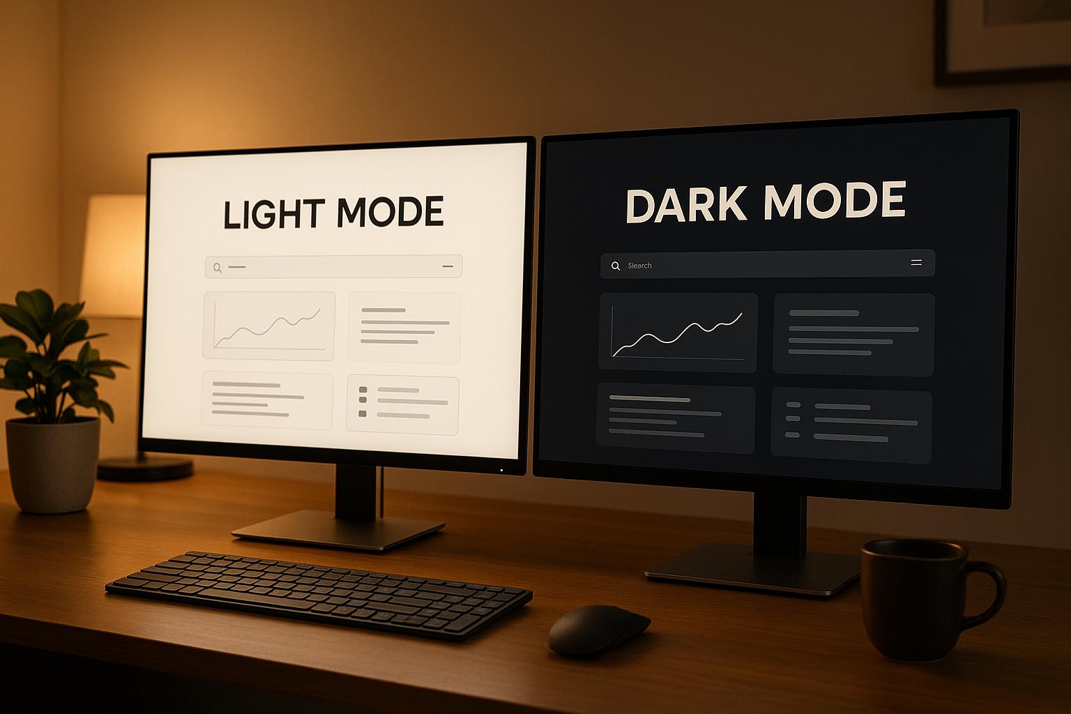
Dark mode and light mode are no longer just design choices – they’re now essential to user experience. Each impacts readability, comfort, energy use, and brand perception in unique ways. Here’s a quick breakdown to help you decide:
- Dark Mode: Ideal for low-light use, reduces eye strain at night, and saves battery on OLED screens. However, it demands careful design for readability and contrast.
- Light Mode: Better for reading in bright settings, offers clear visuals, and works well for professional or content-heavy apps. But it can strain eyes in dim environments.
Quick Comparison
| Aspect | Dark Mode | Light Mode |
|---|---|---|
| Eye Comfort | Best for low-light use | Best for bright settings |
| Battery Life | Saves power on OLED screens | Consumes more power on OLED screens |
| Readability | Requires precise contrast adjustments | Easier to achieve high readability |
| Color Accuracy | Needs tweaks for branding consistency | Colors appear as intended |
| Best For | Nighttime, entertainment, creative apps | Daytime, productivity, content-heavy apps |
Offering both modes with features like automatic switching ensures users get the best experience. Focus on accessibility, contrast, and user preferences to implement these effectively.
Light vs Dark Mode: What’s the Best in UX/UI Design?
1. Dark Mode
Dark mode, once a niche feature, has become a standard in user experience design by 2025. This design approach features dark backgrounds paired with light text and elements, creating a visually striking and functional interface.
Design and Visual Impact
Dark mode delivers a sleek, modern aesthetic while establishing a strong visual hierarchy. The contrast between light elements and dark backgrounds naturally highlights important components like buttons and icons. Many users associate this design with professionalism and focus, which is why it’s been a staple in creative tools and development applications for years.
However, designing for dark mode requires careful attention to detail. Pure black backgrounds can feel harsh, so designers often opt for very dark gray tones to improve comfort. Accent colors also need tweaking to ensure they remain balanced and don’t overpower the interface.
Typography in dark mode presents its own challenges. Light text on dark backgrounds can sometimes appear to "glow" or cause halation, making it harder to read. To combat this, designers may use heavier font weights or increased letter spacing for better clarity. These adjustments not only enhance readability but also improve the overall user experience.
Usability and Accessibility
Dark mode brings unique usability and accessibility challenges. For instance, some users with astigmatism may find it harder to read light text on dark backgrounds due to visual distortion, such as blurring or halos during prolonged reading. Ensuring higher contrast ratios than the standard 4.5:1 can help improve readability in these cases.
For users with light sensitivity or photophobia, dark mode can be a relief, especially in dimly lit environments. However, frequent switching between light and dark themes can sometimes cause eye strain, highlighting the importance of offering a consistent, system-wide dark mode that aligns with user preferences.
Battery Efficiency
Dark mode isn’t just about aesthetics – it can also save battery life on devices with OLED or AMOLED screens. These displays conserve energy by turning off individual pixels to display true black, reducing power consumption. While LCD screens lack this capability since their backlight stays on regardless, the energy-saving potential on OLED devices makes dark mode a practical choice for many users.
User Preference and Adaptability
The steady rise in dark mode adoption reflects its growing importance in modern interfaces. Many users now expect features like automatic switching based on system settings or environmental lighting. For instance, interfaces that adapt to low-light conditions by enabling dark mode enhance usability and comfort.
Preferences for dark or light mode often vary based on demographic factors. Younger users and those in tech-heavy fields tend to favor dark mode, while others might stick to light mode for its readability. Offering both options ensures inclusivity and user satisfaction. Additionally, allowing features like scheduled theme changes or adjustable dark theme intensity gives users greater control and personalization. These adaptive elements are crucial for meeting diverse user needs and ensuring smooth transitions between modes.
2. Light Mode
As of 2025, light mode continues to be the default interface design, featuring dark text on light backgrounds. This classic setup is rooted in usability and familiarity, standing in contrast to the sleek, modern appeal of dark mode. Each approach has its own strengths and trade-offs.
Design and Visual Impact
Light mode offers a polished and open aesthetic, creating a professional and spacious feel. This makes it particularly effective for content-heavy applications like news platforms, productivity tools, and online stores. The bright background naturally lends itself to a clean and airy design.
One of light mode’s standout features is its flexibility in design. Colors appear more vivid and accurate against light backgrounds, making it easier to create visually pleasing interfaces without complex tweaks. Brand colors remain true to their intended look, avoiding the adjustments often needed for dark mode.
Typography also benefits from light mode, drawing on traditional print design principles. This ensures text is immediately readable without requiring compensatory font changes or enhancements.
Usability and Accessibility
Light mode shines when it comes to readability over long periods. Users often find it easier to read large blocks of text in light mode, as it reduces the eye strain that some experience with light text on dark backgrounds. This makes it the go-to choice for applications that involve extensive reading, such as documentation, articles, or educational tools.
For users with certain visual conditions, light mode can be more accessible. For example, individuals with astigmatism often find dark text on light backgrounds easier to read, as it minimizes the halation effect that can make light text appear blurry or distorted. Additionally, light mode performs better in bright environments, reducing issues with screen glare.
Meeting standard contrast ratios is also more straightforward in light mode. This simplifies the process for designers aiming to create inclusive experiences, as less testing is required to ensure accessibility.
Battery Efficiency
Light mode does have a downside when it comes to energy consumption on OLED and AMOLED displays, as these screens require pixel illumination to display white and light colors. This results in higher battery usage compared to dark mode on such devices.
However, the impact on battery life depends on the type of screen. On LCD screens, which use a constant backlight regardless of color, the difference in power consumption between light and dark mode is negligible. For users with LCD devices or those who frequently charge their devices, battery efficiency may not be a significant concern when choosing between modes.
User Preference and Adaptability
While dark mode is often chosen for low-light comfort, light mode remains a favorite in professional and work settings. It appeals strongly to older demographics and those in office environments, offering a consistent experience that aligns with traditional reading habits and physical documents.
Light mode also adapts well to a variety of lighting conditions. Unlike dark mode, which excels in dim settings, light mode performs reliably in bright offices, outdoor environments, and other well-lit spaces. This versatility makes it a dependable option for applications used throughout the day.
User studies consistently show that preferences for light mode are tied to task type and duration. People often select light mode for work-related tasks, reading-intensive activities, and daytime use, while dark mode is more commonly reserved for creative work, entertainment, or evening browsing sessions.
sbb-itb-51b9a02
Advantages and Disadvantages
When comparing dark and light modes, it’s clear that each has its own strengths and weaknesses, affecting user experience, accessibility, and technical performance. Here’s a closer look at what each mode brings to the table.
Dark mode shines in low-light environments, offering a sleek aesthetic and reducing eye strain when used at night. It’s a favorite for entertainment apps, creative tools, and evening browsing. However, it requires careful attention to contrast and color choices to maintain readability and stay consistent with branding.
On the other hand, light mode is praised for its clarity and familiarity, making it a go-to for content-heavy platforms like news sites or documentation. While it performs well in bright settings, it can feel harsh in dimly lit environments for some users.
Here’s a breakdown of the key differences:
| Aspect | Dark Mode | Light Mode |
|---|---|---|
| Eye Comfort | Ideal for low-light conditions | Better for extended reading in bright settings |
| Battery Life | Extends battery life on OLED screens | Can drain more power on OLED displays |
| Accessibility | Demands precise contrast adjustments | Easier to achieve accessible contrast levels |
| Color Accuracy | May need tweaks for consistent branding | Maintains intended color appearance |
| Best Use Cases | Entertainment, creative tools, evening browsing | Productivity, content-heavy apps, professional use |
| User Demographics | Appeals to those seeking a modern, stylish look | Preferred in traditional or professional contexts |
| Design Complexity | Requires nuanced design for readability | Simpler to implement |
| Environmental Suitability | Works best in dim or dark settings | Adaptable to various lighting conditions |
Ultimately, the choice between dark and light mode depends on your audience and the context of your app. Apps designed for daytime use or professional settings often benefit from light mode, while those geared toward nighttime use or creative tasks may thrive with dark mode. Many applications now offer both options, with features like automatic switching based on system preferences or time of day, ensuring a more tailored experience for users.
Conclusion
The decision between dark and light mode ultimately depends on understanding your audience and aligning their preferences with your business objectives. Dark mode shines in scenarios like entertainment apps, creative tools, or nighttime use, where reducing eye strain is a priority. On the other hand, light mode is a better fit for productivity tools, content-heavy platforms, and professional environments where clear readability is crucial.
Offering both modes from the start is a smart move. Incorporate automatic switching to adapt to different user contexts and build design systems that can evolve over time. This flexibility not only enhances user satisfaction but also positions your product to stay relevant as new technologies and design trends emerge.
Execution is everything. Poor contrast or inconsistent design in either mode can drive users away. Prioritize proper contrast ratios, cohesive color schemes, and rigorous testing across devices and lighting conditions. Let user feedback and real-world data guide improvements instead of relying on assumptions.
Accessibility should remain at the heart of your design choices. Whether you opt for dark mode, light mode, or both, ensure your interface meets WCAG standards and accommodates users with diverse visual needs. This approach is key to reaching and engaging your entire audience.
FAQs
How do I decide whether to use dark mode or light mode for my app’s users?
Choosing between dark mode and light mode for your app comes down to user preferences and the context in which it will be used. Dark mode tends to shine in dimly lit settings, helping reduce eye strain and even saving battery life on OLED screens. Meanwhile, light mode is more practical in well-lit environments and for tasks where clarity and visibility are key.
To address varying user needs, it’s a smart idea to include a toggle option that allows users to switch between modes. This not only makes your app more user-friendly but also shows that you value their comfort and adaptability. By understanding your audience and how they typically use your app, you’ll be better equipped to choose – or offer – both modes effectively.
How can I ensure my dark mode designs are easy to read and accessible?
To create dark mode designs that are easy to read and user-friendly, it’s essential to focus on strong color contrast. Stick to a contrast ratio of at least 4.5:1 for regular text and 3:1 for larger text. Instead of using pure black for backgrounds, go for dark grays or muted tones. These choices help reduce eye strain and make the content easier to read.
It’s also a good idea to test your designs with accessibility tools. Simulate various user settings, like increased text sizes or high-contrast modes, to ensure your design works well for everyone. By combining user feedback with consistent testing, you can fine-tune your designs to meet a wide range of needs and offer a better experience across devices and environments.
How does choosing between dark mode and light mode influence an app’s branding and how users perceive it?
The choice between dark mode and light mode can greatly influence how users experience your app and perceive your brand. Dark mode is often seen as sleek and modern, giving off a cutting-edge vibe that resonates with users drawn to a more contemporary, stylish aesthetic. In contrast, light mode tends to project a sense of trust, reliability, and professionalism, making it ideal for apps designed for corporate or formal environments.
Dark mode creates an immersive and polished feel, while light mode emphasizes clarity and a welcoming tone. Deciding which mode to use – or whether to offer both – should align with your brand’s identity, the preferences of your target audience, and how your app is intended to be used.


Leave a Reply